Responsive Web Design

Federal Communications Commission Website Redesign Case Study

FCC Website Redesign
Summary

A redesign process that involved assessing the existing usability issues, conducting user research, and analyzing competing resources.

Tools

Pen and paper, Miro, InVision, Figma, Figjam, Zoom, Teams

Role

Individually-led project. User researcher, interaction designer, visual designer.

Timeline

4 weeks

Prototype
Figma link
Project Overview

Conducted analysis, research and created designs individually while getting feedback from other designers and instructional staff.

The Problem

The FCC website suffers from information overload, making it challenging to find specific information amidst the extensive content on regulations, policies, reports, and resources. User-centered design improvements are needed to enhance navigation and organization, alleviating the issue of overwhelming data.

The Solution

Boost the task completion rate by restructuring and simplifying navigation


Empathize

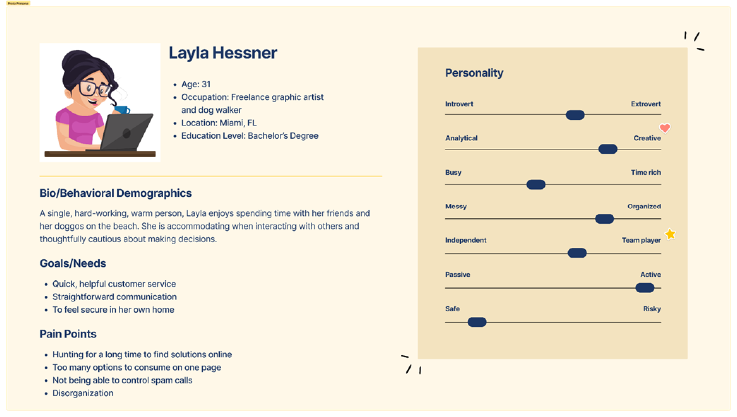
To begin the project, I engaged in the empathize phase of the design thinking process, and a proto-persona named Layla Hessner was developed. For this project Layla was my target user.

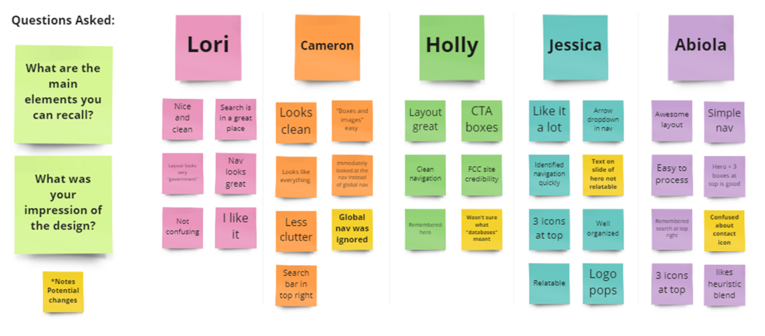
User interviews were conducted as a follow-up to the development of the user path. A total of five interviews were conducted to gain valuable insights and perspectives. These interviews were used to validate or invalidate the proto persona I had developed in Layla.

Layla has been having issues with her home internet dropping frequently. After many failed attempts to resolve this with her internet provider, she decides to file a complaint complaint with the FCC.

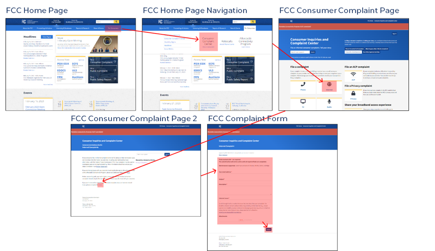
Usability Test Objective (as seen below): Navigate to the Consumer Complaint Center on the FCC website and file an informal complaint about the issues you're having with your internet.
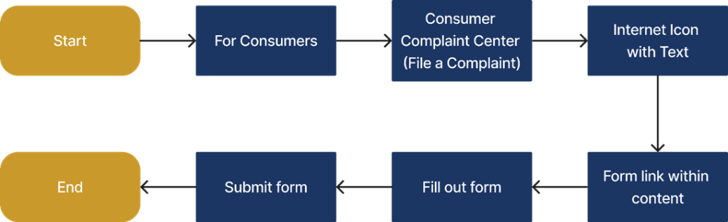
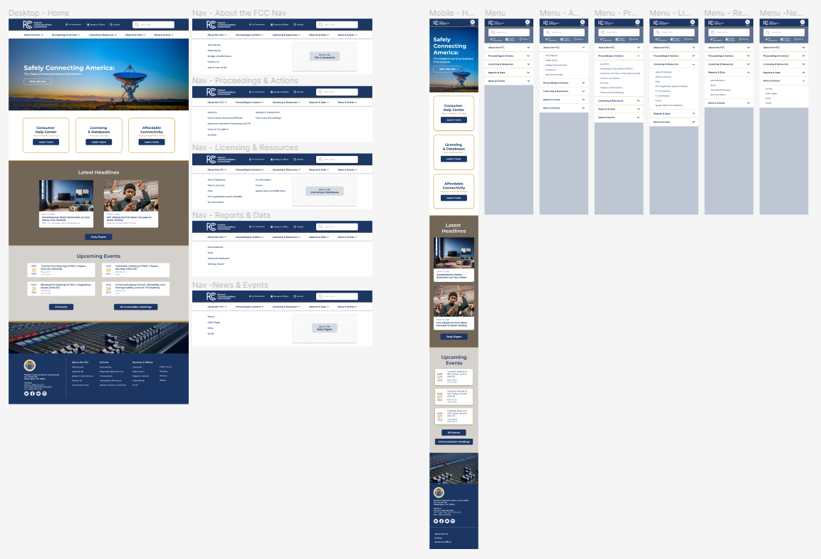
Sample user flow:


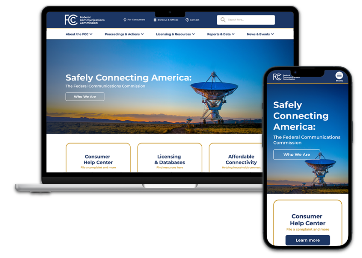
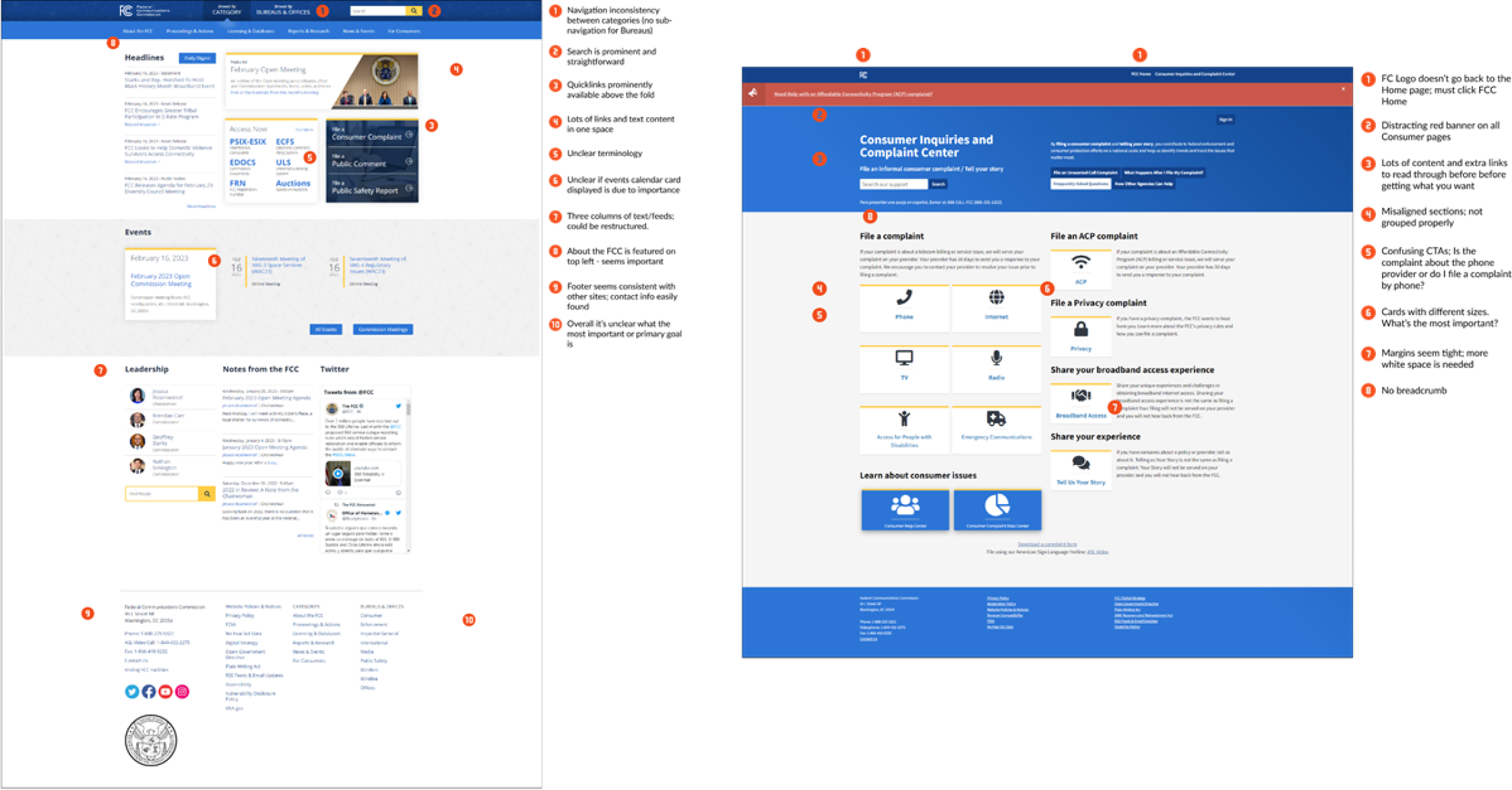
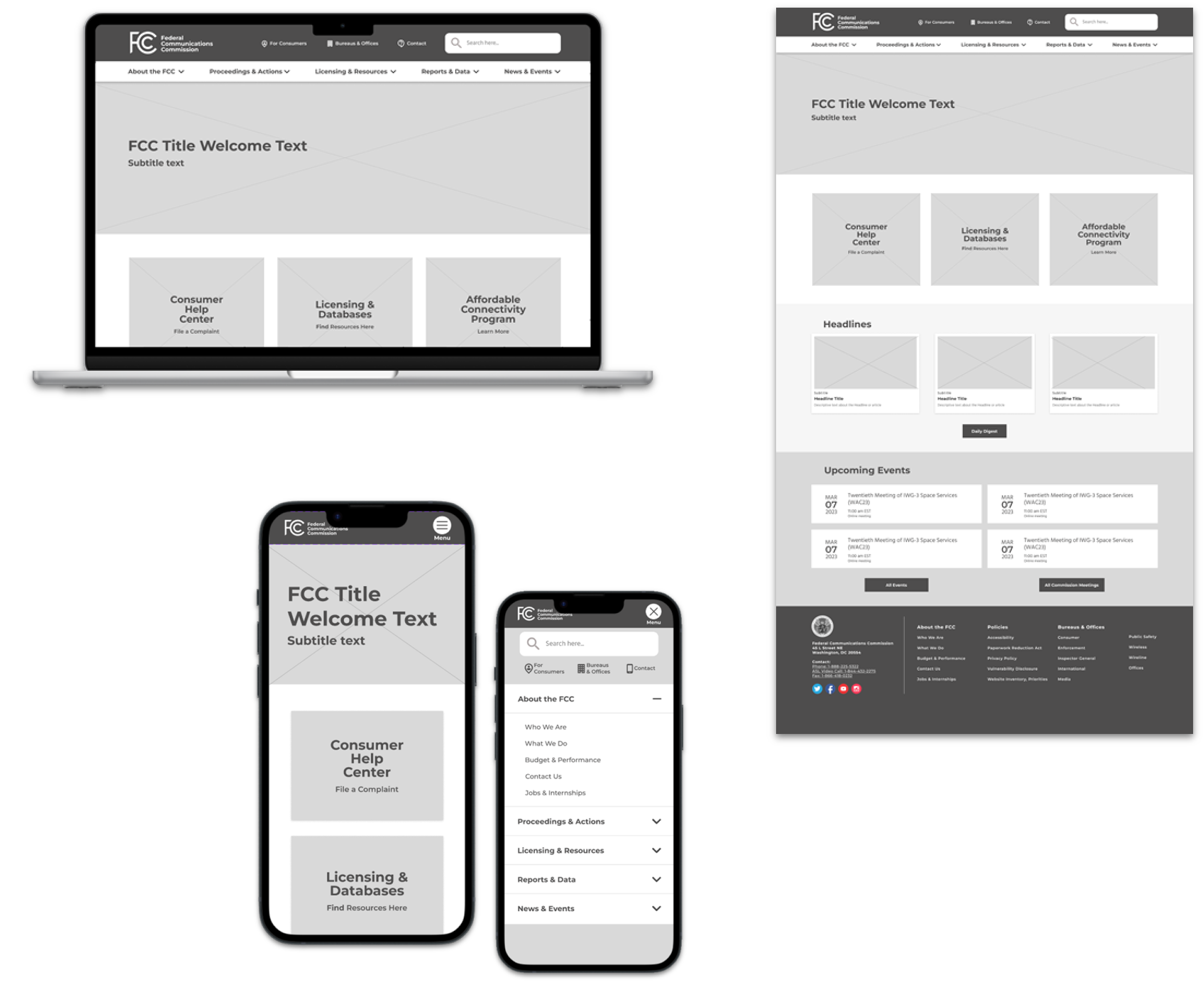
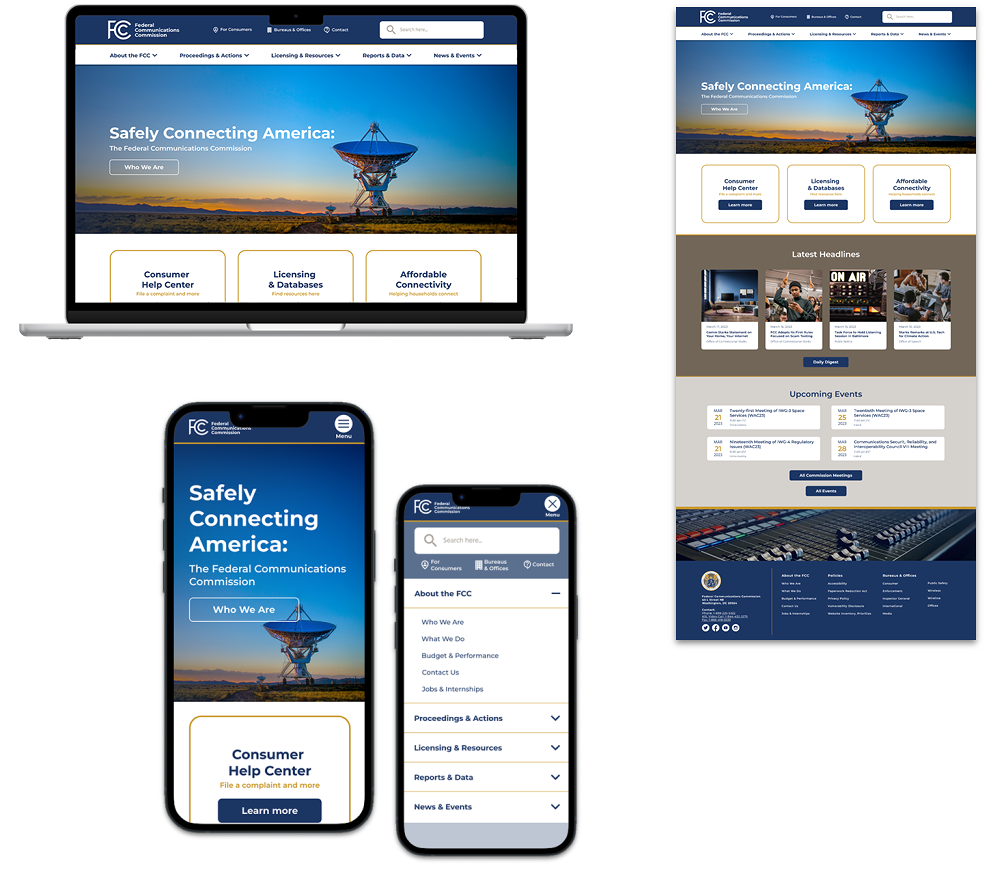
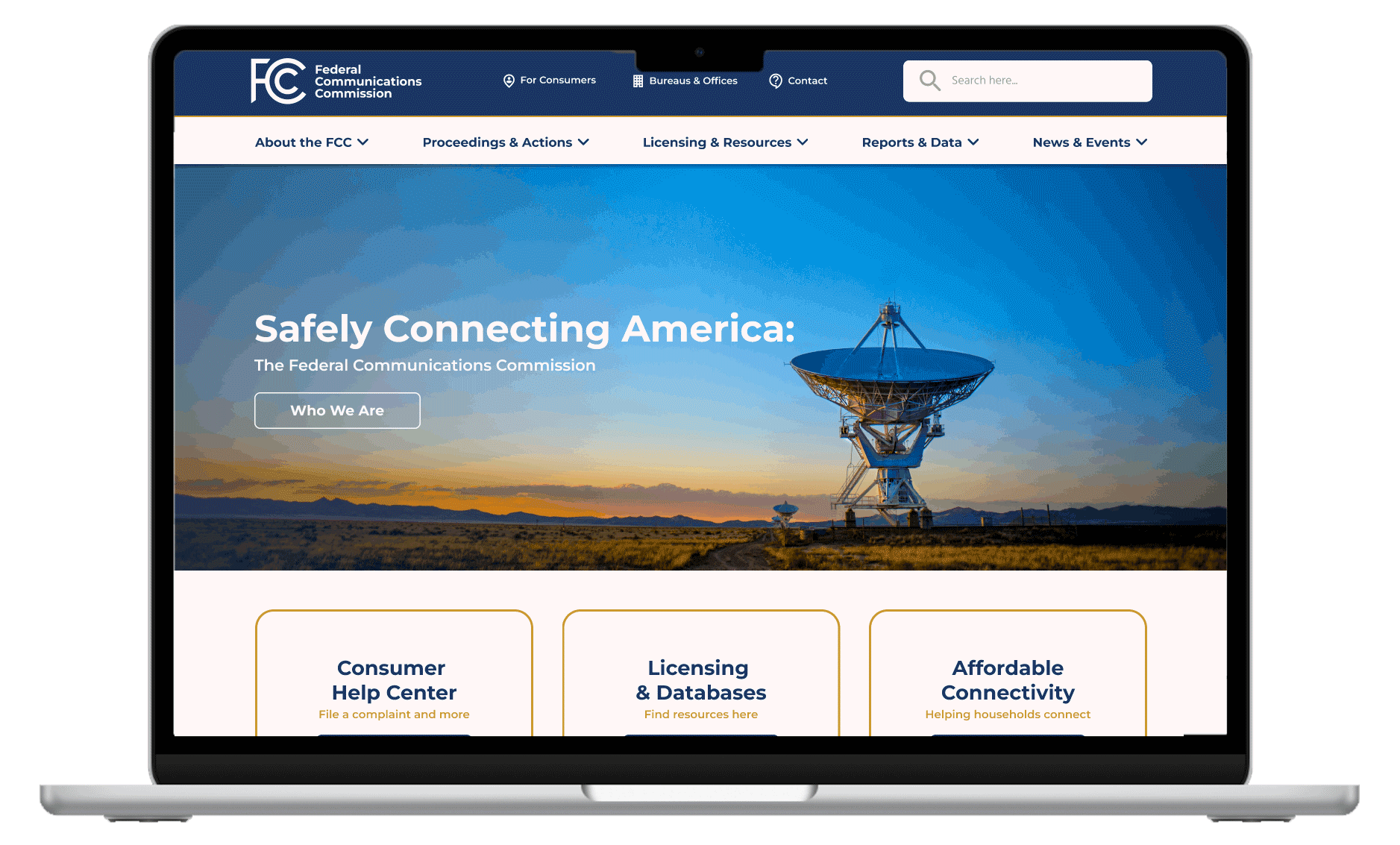
As shown through the FCC website:


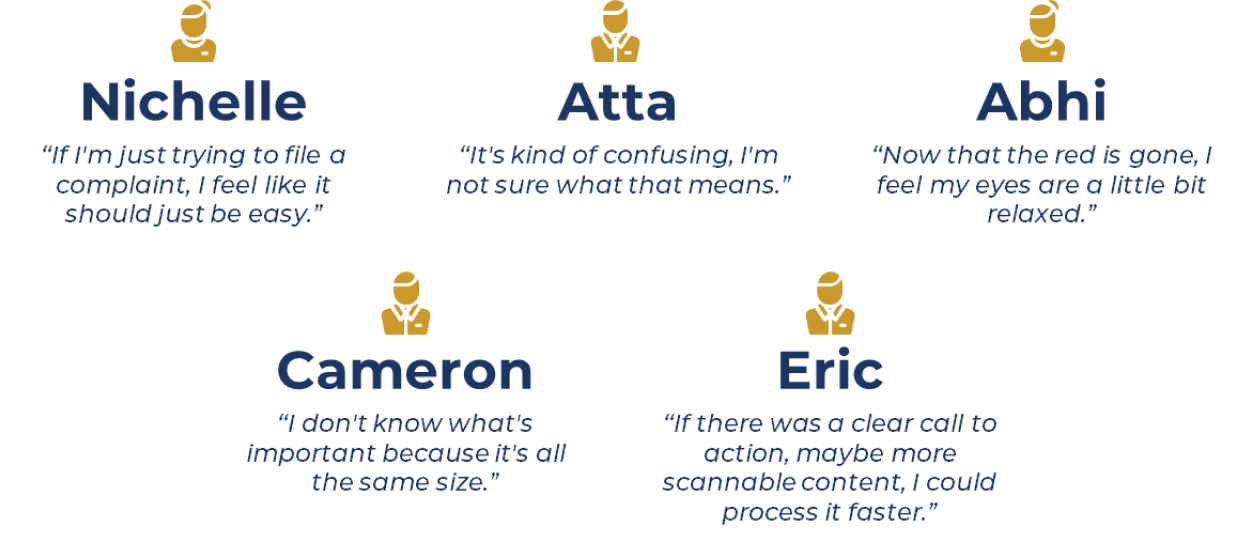
Feedback from user interviews:

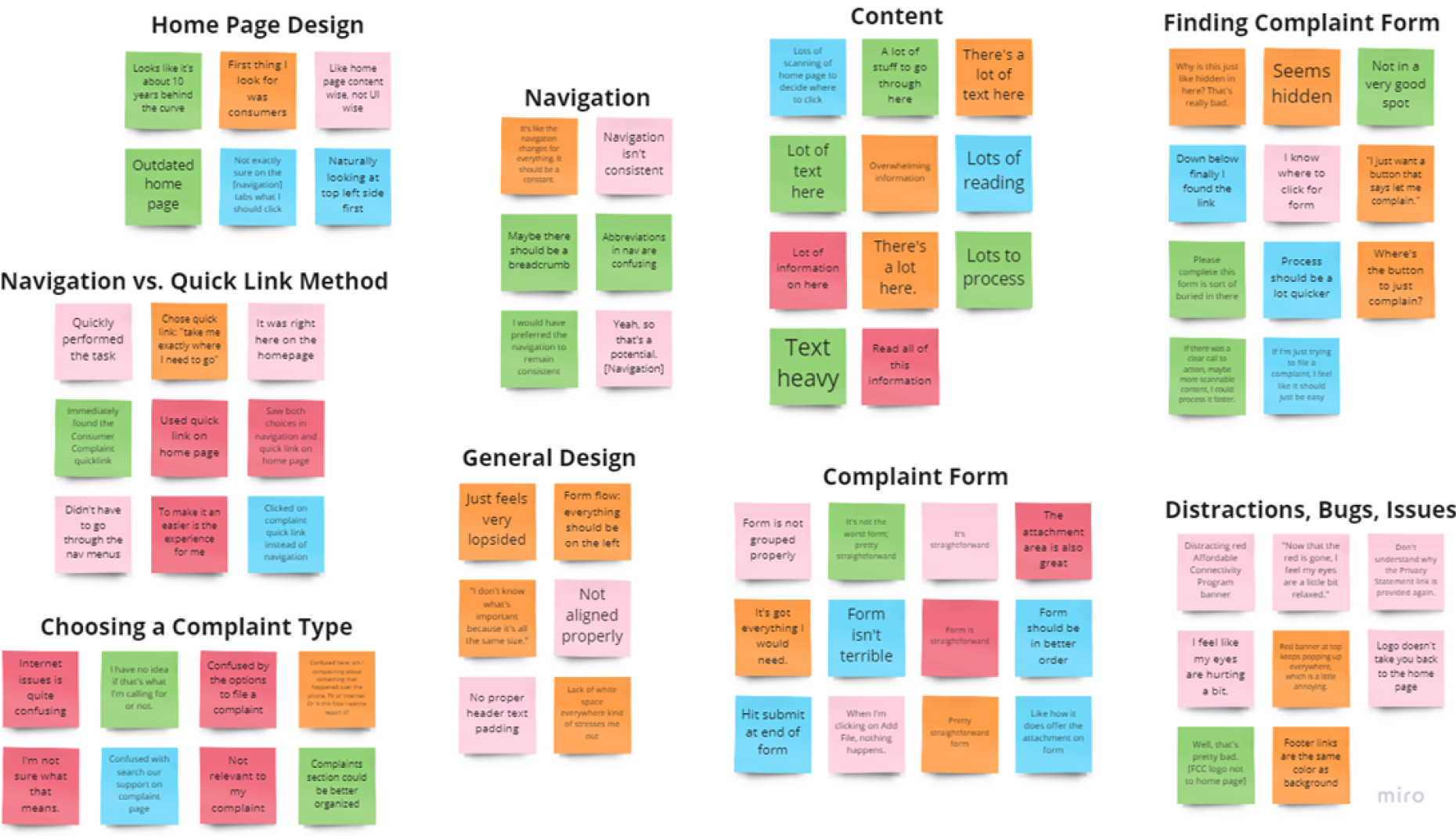
Once I conducted the interviews, I synthesized the data with an affinity diagram and a feature prioritization matrix. Affinity diagram seen below:


Define

Analysis of Information Architecture

Information architecture is essential for government websites as it enhances user experience, accessibility, efficient content management, effective communication, search engine visibility, compliance, and cross-department collaboration. By prioritizing information architecture, governments can provide citizens with user-friendly and accessible digital platforms that deliver valuable information and services effectively.

Navigation Card Sorting and Site Map exercise for a more user-friendly experience:


Ideate

The Ideate phase of the design thinking process is all about generating a wide range of creative and innovative ideas. It's a divergent thinking stage where the goal is to generate as many ideas as possible without judgment or evaluation.

I began this phase with a mood board and began sketching out ideas for solutions

Then, I conducted 5 second usability tests on the results.


Prototyping

The prototyping phase is a crucial part of the design thinking process. It involves creating tangible representations or mock-ups of ideas generated during the ideation phase. Prototypes serve as a means to test and refine concepts, gather feedback, and make informed decisions before moving into the implementation phase.

This phase began with a UI Style Guide:

From there, I created created a clickable prototype in Figma of wireframes and high fidelity designs, both for desktop and mobile devices.


Test

This phase focused on evaluating and validating the prototypes developed during the previous stages. It involved gathering feedback, observing user interactions, and assessing the viability and effectiveness of the proposed solution.

In this case, feedback was only asked for the navigation and home page designs. Small iterations were made due to time constraints of the project.